My Shoe Ad
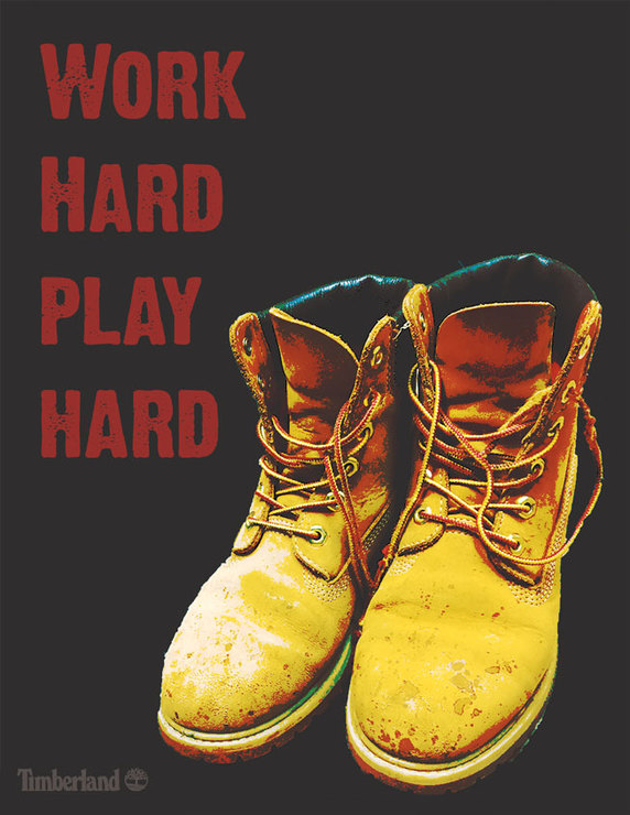
First of all, I didn’t really stick to the shoe ads I chose except some of concepts from the Nike shoe ad. I really wanted to use my Timberlands for my shoe since they’re my favourite shoe to wear. Once I took he picture of my shoe/boots, I cut them out and made a png of them. My first idea was to make the bg look like there was an edge using the gradient but the way I had my shoe, it didn’t work out. Also the gradient seemed more like the shoe needed to be somewhat illustrated instead of an “actual” shoe. So instead, I made my bg black and then put my shoes on top in a new layer. I looked up Timberland shoe ads to inspire me in what I wanted. The Nike shoe ads was a hit for me since they didn’t show the actual shoe and it looked not “real” with all the words. I wanted my shoe to not look as “real” and I was having a hard time. I looked back and another project that I did to help me with steps I could use. I put another layer on top and coated the whole thing in grey. I looked through all the blend modes to see which one I like more. I settled on hard mix and then called my layer ‘Life Saver’ because I didn’t know if it would work out or not. Leaving the opacity at 100% was a bit too hard in the ad so I deceased it to 61%. I did the same thing to the logo but the blend mode I chose for it was Exclusion and I changed the opacity to 58%. The hardest thing that I needed to settle on was the saying and the font. I actually thought of the saying the morning of Nov. 16 2017. I was listening to a song that said the words “work hard, play hard” and it was stuck in my head. Once I looked at my shoes I was set on that saying. The last thing was the font. I went through 5 different fonts and settled on “Dirty Headline”. I wanted a font that looked rough and “dirty” looking but still fun. Also, the positioning of the saying took me a bit to figure out. Putting it to the left of the ad seemed to be the best way to go. Annnnnd- that’s how I created my shoe ad for my Timberlands
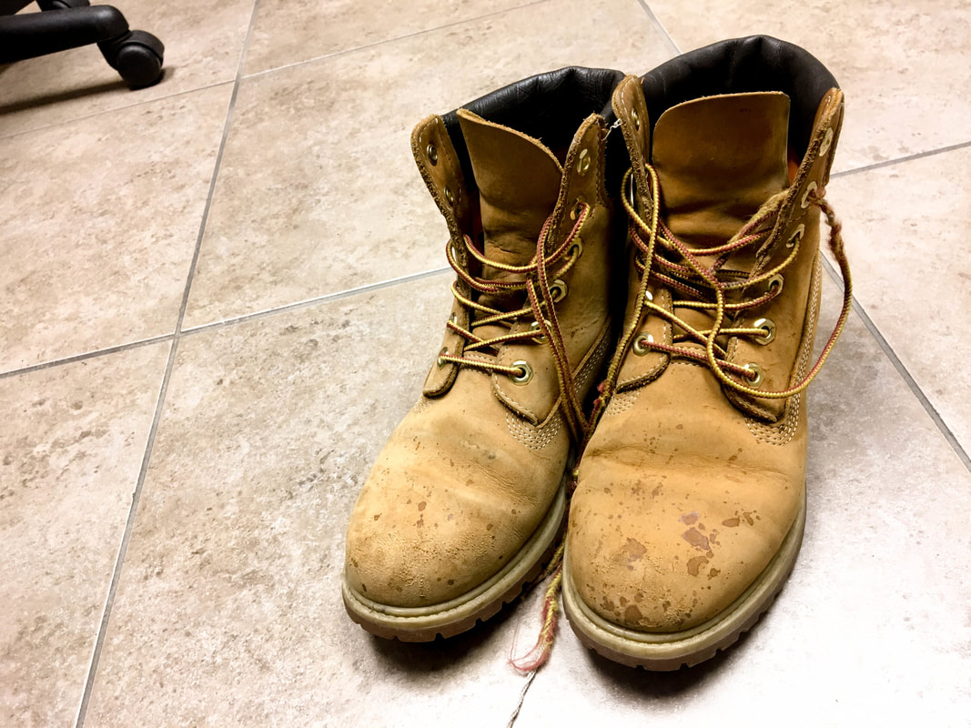
Original photo
